Introducing Cairo's first Public Transportation Map
Introducing Cairo's first Public Transportation Map
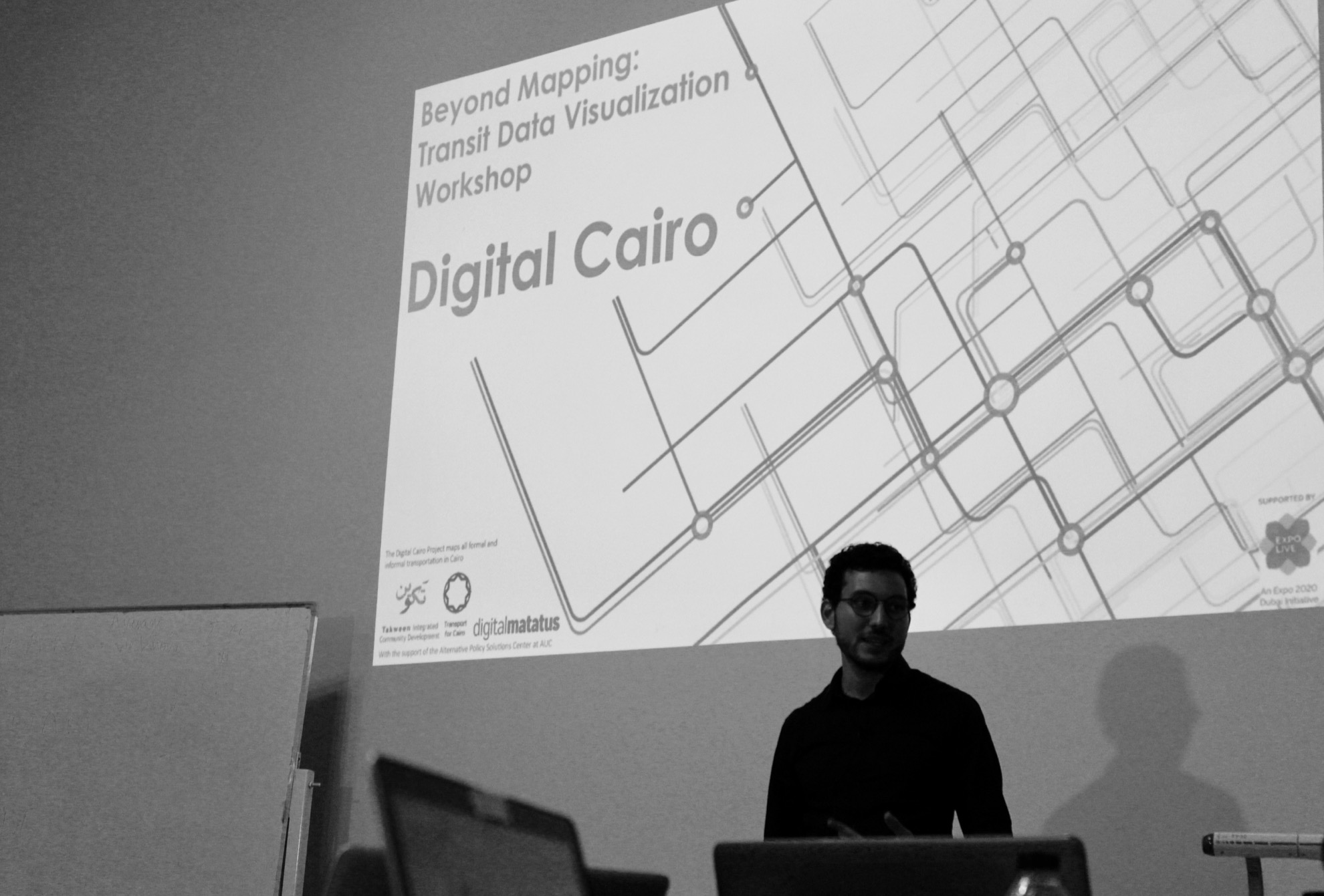
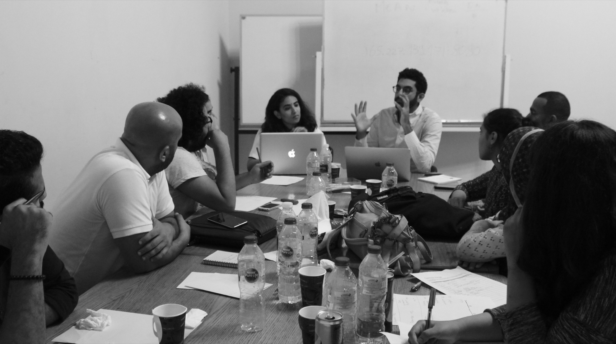
TfC’s recently collected data was used to lead a data visualization workshop in Cairo in the American University in Cairo’s Tahrir campus in late August, 2018. During the 3-day workshop, the teams learned about data visualization techniques, the context of the data, and its sociological implications and biases.

As part of Digital Cairo, TfC collected data on 345 processed trips and 1300 stops across the Greater Cairo Region. More specifically, we covered all intra-city public transport within six key New Desert Cities. All modes were covered, including formal and informal modes because we believe the solution lies in multi-modal inclusive transport planning. As always, the data is released as Open Data.
Participants were invited to join after a rigorous application process a month in advance. The competition was fierce and only the top 20% were offered spots in the workshop. They were given access to our data along with 4 presentations covering:

The teams received ongoing support from TfC and their output was reviewed by our friends at MIT. Each team was asked to present their visualizations along with a description of their motives and their findings. The outputs in detail can be viewed here:
| Team 1 | Team 2 | Team 3 | Team 4 |
We found that Team 3’s outputs were the most easily readable and the most impactful. Their visualization can quickly show residents of four parts of the city how far they can commute using any combination of public transportation and walking. Below is the visualization for origins at New Cairo. For other origins and more details, click on Team 3 above.
